Lately I have been seeing advertisements for simple iPhone home screen interfaces. These layouts tout a minimal design with just text and a few simple icons for minimizing distractions. With Apple introducing more customization options, I decided to see if I could create a clean design using Shortcuts and custom icons. Apple is introducing more customization with iOS 18 this Fall, but I am using tools that have been available for some time, relying on Apple Shortcuts and using custom icons.
I made two versions of my minimal design, a light version for daytime and a dark version for nighttime. I am using Focus Modes to switch between the designs and automating them to switch in the morning and the evening.
Criteria
I wanted a one-page design that was primarily a white background with dark text. I wanted to obscure icon shapes as much as possible. It doesn’t really look like an iPhone screen because you don’t see the iconic app shapes.1
I really like the simplicity of this design. I have found that I get less distracted with apps that I don’t need to look at throughout the day. Since my RSS reader isn’t on my home screen, I have only been browsing my RSS feeds when I think to search for it.
I also chose a simple Apple Watch screen to pair with these two home screens. When I switch to these focus modes, my watch also switches to the Solar watch face.
Process
Here are the details for how I made this minimal design. I relied on the Shortcuts app for making custom icons, or bookmarks on the home screen for opening specific apps. I used Pixelmator Pro for creating and editing my custom icons. I also used Widgetsmith for creating widgets where I can specify the background color so that they blend into my wallpaper.
- Make a solid white/black wallpaper in Pixelmator Pro. I wanted something slightly off white. Pixelmator, and other editors, have templates that are the right size for the iPhone display.
- Make custom icons in Pixelmator Pro. I also used a template for the size. I then matched the color of my wallpaper to the background of my icon. I only wanted text for my icons. Having the same color on both would give the appearance of only text. I saved these as PNG files. I also used Pixelmator Pro’s Super Resolution feature so that my text looked very sharp on the iPhone’s retina display.
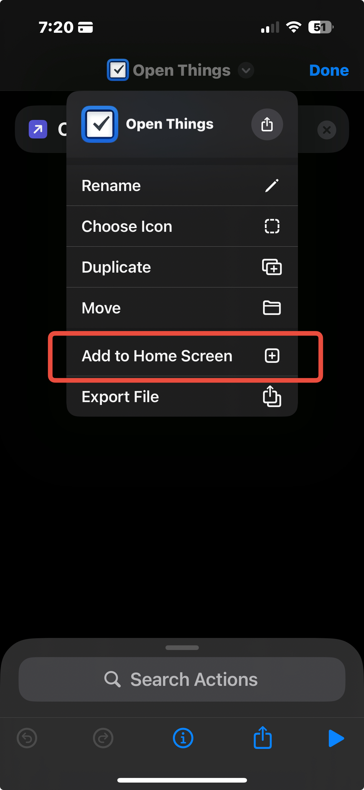
- Use Apple Shortcuts to make a custom app icon that can be placed on the home screen. This will be the easiest shortcut to make. You only need one action: open app. You can then choose “Add to Home Screen” from the drop down menu. Here you can choose the custom PNG icon that you made.

- Widgetsmith is for making custom widgets. These are great because you can customize the look and feel, allowing you to match the exact shade of your wallpaper, making the widget blend in with the background. I used this to make my calendar, solar path, and step count widgets.
The iPhone used to be so locked down, and still is in many ways. It has been fun to make these customizations and more will be possible with iOS 18 this fall.2 I did use the new large icon setting in iOS 18, which hides the icon names and makes my clean interface posssible.
